Thanks Victoria! You're a class act. 
redbubble.com/people/deeferdoodles
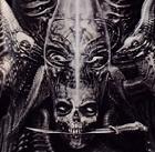
^^^^ Place to buy t-shirts and other stuff featuring my artwork.
^^^^ Place to buy t-shirts and other stuff featuring my artwork.


Faffy wrote:I am slightly torn between the body of #3 and the banner of #2
(I still can't get the design previews to work though.)
Victimlas wrote:Faffy wrote:I am slightly torn between the body of #3 and the banner of #2
(I still can't get the design previews to work though.)
Have you tried changing the board style in your profile? Try this link: http://hevydevyforums.com/forums/ucp.php?i=165 and where you see "My board style" use the dropdown to change it to the mock-ups: Design2 and Design3. Be sure to click "submit" to save the changes, and once you go to Home you should see the design.
Please let me know if that still doesn't work
Faffy wrote:How did I miss that?
That worked! Thanks!
One thing to note is that both of the designs make the current layout less responsive. That is, it doesn't look too good when the width of the browser window is reduced.

Telescopes Are Gay wrote:Wow, that was quick. I guess it's ok to divulge now that I was behind Design #2? Congrats to the winner!
Users browsing this forum: No registered users and 6 guests


