Hey! You're awake!
#224608 by Fjar
Fri Nov 13, 2009 4:00 pm
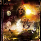
I'm surprised to see there hasn't been a dedicated discussion on this.. but does anyone have any interpretations of the artwork for the album? Three crayons, two broken in different places, one unbroken.

I'm gonna throw the idea that 'it's not just a cool picture' out there.. any ideas?
#224613 by cjb
Fri Nov 13, 2009 4:19 pm
the wore out one is SYL, the broke one is DTB, the middle one is DTP.......as far as Im aware....

the purple smear is SYL and DTB clashing.......
#224662 by Wander
Sat Nov 14, 2009 2:58 am
I wonder what's the thing with the crayons on the back of the booklet. There's the red used one (again), a veeery short orange one and a semi-used yellow one.
#224698 by TallNerdGuy
Sat Nov 14, 2009 10:47 am
I'm wondering whats up with page in the booklet that shows a package (much like the one my uber package came in) resting on a door. Is that supposed to be a Dev fan in the door's window eagerly awaiting their pre-order?
#224703 by :)
Sat Nov 14, 2009 11:50 am
Wander wrote:I wonder what's the thing with the crayons on the back of the booklet. There's the red used one (again), a veeery short orange one and a semi-used yellow one.


Steve Vai & The Wildhearts, obviously.
#224894 by Leechmaster
Sun Nov 15, 2009 5:54 pm
cjb wrote:the wore out one is SYL, the broke one is DTB, the middle one is DTP.......as far as Im aware....

the purple smear is SYL and DTB clashing.......


Yep, you're on the ball.

The Dev wrote:I love the cover, I love the art.

It actually seems pretty obvious to me. The red, worn out crayon is SYL, the blue, broken crayon is DTB, and the new green one is the DTP, the purple smudge on the side is the fight between the red and blue.
#224915 by IX10N
Mon Nov 16, 2009 12:46 am
When I first saw it, I took it as a sign of the type of music I should be expecting...

The Red, Green Blue symbolised a modern/futuristic sound, with Red, Green and Blue being the primary colours for televisions, monitors and such, it just seemed to make sense...
Being that they're crayons though, I thought it was a throw back to being a kid, or at least being younger, which in this case would equate to an album with a sound similar to devins earlier work.

If you think I'm an idiot for that theory, forgive me, as I work in graphic design and the first thing that sprung to my mind when seeing the crayons was the "RGB" colour mode that is used. I know that this theory isn't correct, as Dev has already explained it, but yeh, it works!
#224918 by The Dev
Mon Nov 16, 2009 1:20 am
Trav knows best...


Trav?
#224933 by Billy Rhomboid
Mon Nov 16, 2009 3:28 am
My guess is the designer was stumped for inspiration and just quickly snapped a pic of the first objects that came to hand on his desk on a piece of paper. :lol:
#224936 by daneulephus
Mon Nov 16, 2009 4:16 am
:) wrote:
Wander wrote:I wonder what's the thing with the crayons on the back of the booklet. There's the red used one (again), a veeery short orange one and a semi-used yellow one.


Steve Vai & The Wildhearts, obviously.


Great observation. That makes a hell of alot of sense. :idea:
#224937 by swervedriver
Mon Nov 16, 2009 4:17 am
Billy Rhomboid wrote:My guess is the designer was stumped for inspiration and just quickly snapped a pic of the first objects that came to hand on his desk on a piece of paper. :lol:


So by that logic Deconstruction's cover may well feature a stapler, a pencil sharpener and a tape dispenser.
#224945 by Fjar
Mon Nov 16, 2009 5:24 am
Ahh, I get it now! Very clever.

Initially I had an inkling of a synaesthesia-type thing.. where the initials DTP represent the colours of the crayons. That combination of colours doesn't 'fit' with my letters (if I'd done it it would go green (D) blue (T) red (P)) but I know it's different for other people. Ah well!
#224957 by Tree
Mon Nov 16, 2009 7:13 am
Pretty cool thoughts on what they mean.

Who is online

Users browsing this forum: No registered users and 5 guests